 Matt Lane
 The word emergency gets used in everyday life, sometimes in jest or exaggeration:
“We are late for ballet”
“I left my wallet in Wairarapa”
“We have run out of halloumi”
In plain English, an emergency is any event that threatens life, health, property, or the environment, which requires a response. In New Zealand, an Emergency (capital “E”) has specific definitions under various pieces of legislation. To keep us on our toes, different legislation defines Emergency in different ways 🙃. The Civil Defence Emergency Management Act 2002 (CDEM Act) contains one of those definitions and includes the provisions for declaring a state of emergency.
A Declaration of State of Emergency gives Controllers and response agencies additional powers, such as evacuation orders, road closures, requisitioning property, and controlling public movement. A Declaration is a tool, not a requirement: so often emergencies don’t lead to declarations of state of emergency.
Zooming out: how I explored declarations through data
I recently became an alternate Local Controller at Wellington City Council. As part of this we are taught about the mechanics of Declarations. In our course I asked:
What are the contributing factors for declaring?
Are there different regional protocols for declaring?
Do different regions declare more or less often?
Like a new kid starting at a new school, I want to understand not just the norms and the culture. Luckily, NEMA has a dataset of all Declared States of Emergency since 2002:
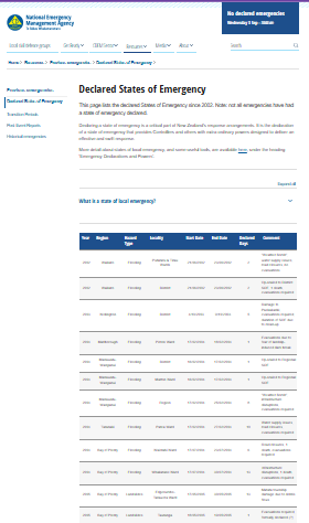
While tables are great for precision, our brains are wired for shapes, movement, and patterns more than rows and columns. So, I needed some graphs.
There’s a quote I half-remember, probably by Hans Rosling:
“Until you’ve made a chart, you haven’t really understood the data.”
– Probably-almost Hans Rosling
Graphs are a great way to explore a dataset and see its breadth, something tables don’t always make obvious. I think the proper term is “exploratory data analysis”. It is like asking: “What have we got in here?”
After I cleaned and standardised the data, added some fields, I was able to make some basic charts:
What the data is saying
It’s mostly weather
Flooding and severe weather account for around four in five declarations. This suggests that, even in a geologically active country like Aotearoa, it’s water and wind, not fault lines, that most frequently push us over the operational threshold for declaring.
Weather is more likely to happen at particular times
Declarations cluster around February and mid-winter, with summer and winter taking the lead as “disaster seasons.” These spikes align with known weather systems: ex-tropical cyclones in late summer and deep storm cycles in July.
Short vs long declarations
Most declarations are short: the median duration for flooding and severe weather is just three days. But a few, like major earthquakes or the pandemic, stretch far longer, skewing the averages and reminding us that some emergencies require stamina.
The rise of ‘severe weather’ as a label
Before 2015, almost no declarations used “severe weather” as a category. Since then, it’s become a go-to label. This most certainly reflects a change in process, rather than a sudden surge in storms.
Different regions, different profiles
Canterbury tops the count with a mix of floods, quakes, and storms, while places like the West Coast are almost exclusively weather-focused. This shows how geography, infrastructure, and hazard exposure combine to shape each region’s declaration “personality.”
What the data is silent on and things to remember
Some emergencies are too rare to show a clear pattern
A 23-year dataset is solid, but it’s not long enough to surface reliable patterns for low-frequency, high-impact events like major earthquakes or pandemics. These events might be underrepresented in the data, but they tend to define entire eras of emergency management when they do occur.
A declaration isn’t the same as an event
Many significant emergencies are never formally declared. The absence of a declaration doesn’t mean the situation wasn’t serious, it may reflect confidence in local capacity, early mitigation, or even different leadership styles or doctrine at the time.
Multiple declarations can come from one storm
When a major system moves across the country, it can trigger several separate declarations, one per district or region. So while the dataset shows over 100 rows, the number of distinct weather systems is much lower.
Trends reflect both the weather and the way we respond
More declarations in recent years may partly reflect more frequent and intense weather, but they may also tell a story about evolving practice. Labels have changed, maybe confidence in declaring has grown, and systems have matured.
Insights and takeaways
Roster and resourcing: February and July are pressure points
If you’re running a duty roster, a contact centre, or any weather affected infrastructure, February and June/July should set off calendar alerts. These are our declaration peaks, and they likely overlap with known weather patterns. Plan for surge capacity during these months.
Comms templates: floods and storms are the bread and butter
The most common declarations are short, weather-related events: flooding and severe weather. That means there’s huge value in having pre-approved communication templates, stakeholder updates, and public safety messages ready to go for these scenarios.
Logistics readiness: some regions need to move fast
Regions like the West Coast and Canterbury are frequent declarers, often due to storms that isolate communities. These areas benefit from ready-to-roll logistics plans, pre-written road closure procedures, isolation response checklists, and arrangements with contractors and lifeline utilities.
After-action learning: long events are gold mines for insights
Events that go beyond the usual 2–3 day declaration window, like earthquakes, or pandemics, likely push systems, roles, and governance to their limits. These are the best opportunities to learn about escalation, fatigue, leadership turnover, and recovery transitions. Treat them as case studies, not just cleanups.
🧠 I’d love to hear what I’ve got wrong or still have to learn! Please get in touch if you’ve explored similar datasets, noticed different patterns, or used similar insights in planning, please share!
