This article was written as a response to Seamus Boyer’s NZ govt websites are wild and free – should we reign them in?

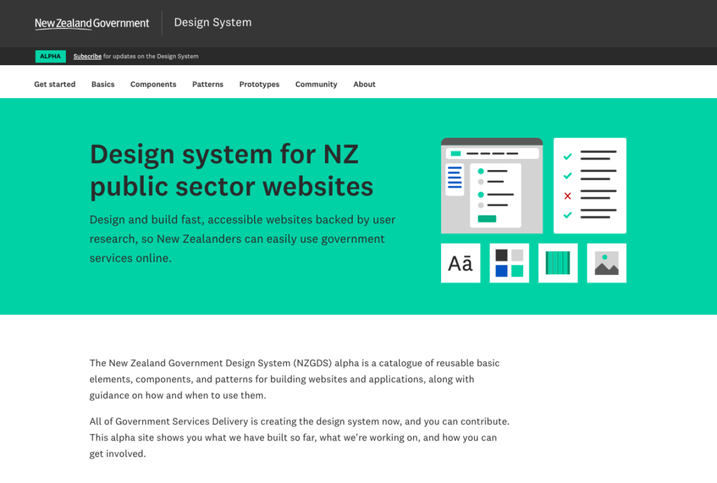
In early 2019 when I read about a new all-of-government Design System I was very excited. I signed up to participate in the usability testing, joined the Slack group, and started making plans for how I could use the new system in my own work.
Since I first saw Tom Loosemore speak at Webstock in 2014 I had been very interested in the UK’s GDS unit. They transformed more than how their public sector manages and presents content, but how they designs, delivers, and supports digital services. The idea that maybe, just maybe, in NZ we could have something similar filled me with hope and excitement. A design system would be the thin end of the wedge for bigger changes. Or it could be good just itself.
They have since grown to be a team of 750.
As the months passed, an old lesson repeated itself: just because an idea is good doesn’t mean it will succeed. There was no mandate for agencies to use the NZ design system. The resources that had been put behind the project were not adequate. It quietly faded away.

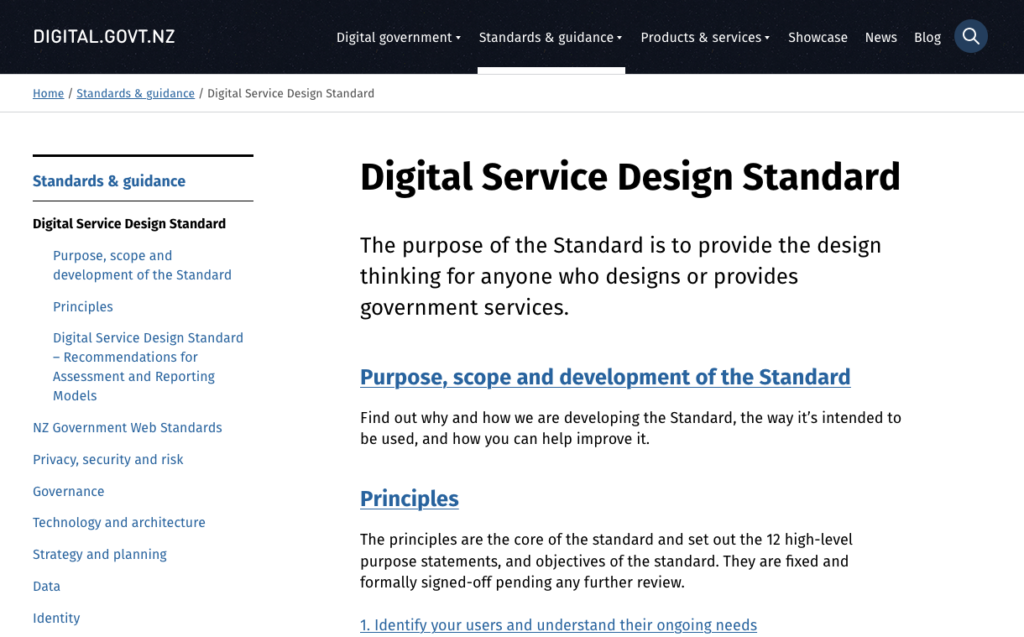
In addition to our NZ Web Standards, we also have the Digital Service Design Standard (DSDS). Everything written in the DSDS is nice and good (very easy to nod along to). But if we’re honest with ourselves, its place in the universe is ambiguous – it lacks teeth. It’s called a standard but as far as I know there is no mandate for any agency to follow it. In 2019 a workshop was run where it was recommended they should “develop clear, specific, measurable outcomes which can be assessed and reported on”. This was never produced. No agency has ever been assessed so we really have no idea what affect the DSDS has had or if people are using it.
The GCDO is currently reviewing the web standards. It doesn’t seem like big changes are being proposed. In the current political climate, the domain of all-of-government digital will likely lie dormant for the next 2 years or so. Though we can expect a series of “jUsT pOUr sOme AI oN It”
So shouldn’t we just mandate all the government websites to look the same?
Yes. No. Kind of.

If Seamus Boyer, as the Minister of Digital Communications, mandated that all departments make their websites look similar, maybe the departments would comply. And maybe that might feel nice for a time.
But we should think carefully about some things:
1. The NZ public sector has been weak at rolling out and/or adopting standardised approaches in digital
It’s tempting to just force everyone to do it (and sometimes, I lean that way when I’m grumpy). But smarter people than me know why government mandates haven’t worked well in New Zealand’s public sector. There are certainly complex incentives at work in the wider ecosystem (budgets to be protected, hills to die one, names to be made). I believe a less discussed success factor for the UK’s GDS was aggressively taking control of the budgets of a multitude departments. And asking busy teams to take on something new without additional resource usually results in average, rather than outstanding, outcomes.
2. Making good digital services is harder than arranging defined interface element
I can imagine a world of uniformly-designed bad digital experiences. Good results need a strong team with enough time and skills. If you give a tired or weak team new templates to use, it won’t make things much better. And if a team already has these skills, their websites are likely already good. In fact, many agencies have created their own advanced design systems by now.
3. Keeping a design system running needs a full-time team that can handle requests from many different groups who use it.
Let’s imagine you have 100 agencies using your design system, you need a team of at least 10 to run the thing. This is a solvable problem but… who’s investing (and centralising!) in the current climate?
4. The opportunity is much bigger than the look and feel
We need to think beyond just how a website looks to people who can see it. Some people don’t look at websites—they listen to them using screen readers. And sometimes, it’s not even people using the website. It could be search engines, large language models, or other apps that access the site.
We should focus on more than just how things look. We need to think about linked data, sharing code repositories, making sure everyone can use the site (which is what accessibility is about), semantically rich content that machines can understand, API standards, good service design, and probably other things we might not have thought of yet.
A design system can make all of this easier, but also… you don’t need an all-of-govt design system to do it either.
None of these are knock-down arguments against an all-of-government design system. But they do cause pause to ask:
- what happened last time?
- do those obstacles still exist, and can they be overcome?
- do we have the political will and long-term resourcing to make it work?
When we do this, we need to do it once, and do it properly. I imagine it will require large-scale disruptive changes across government departments to change both:
- the way projects and operations are financed and governed, and
- how platforms and services are designed and built or procured.